The architects from their works
THE URBAN COLLAGE
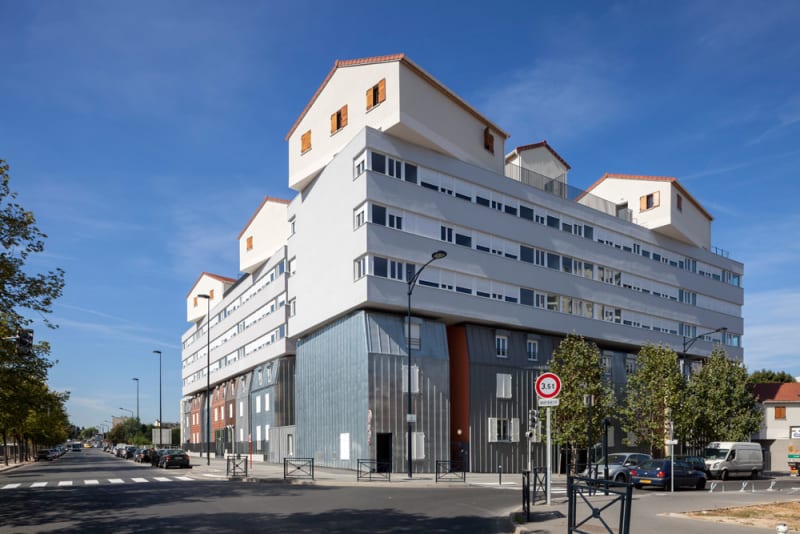
The “Urban Collage” (Collage Urbain) was one of the works of the French architect Maison Edouard-François, who I have already presented on “PA2”.
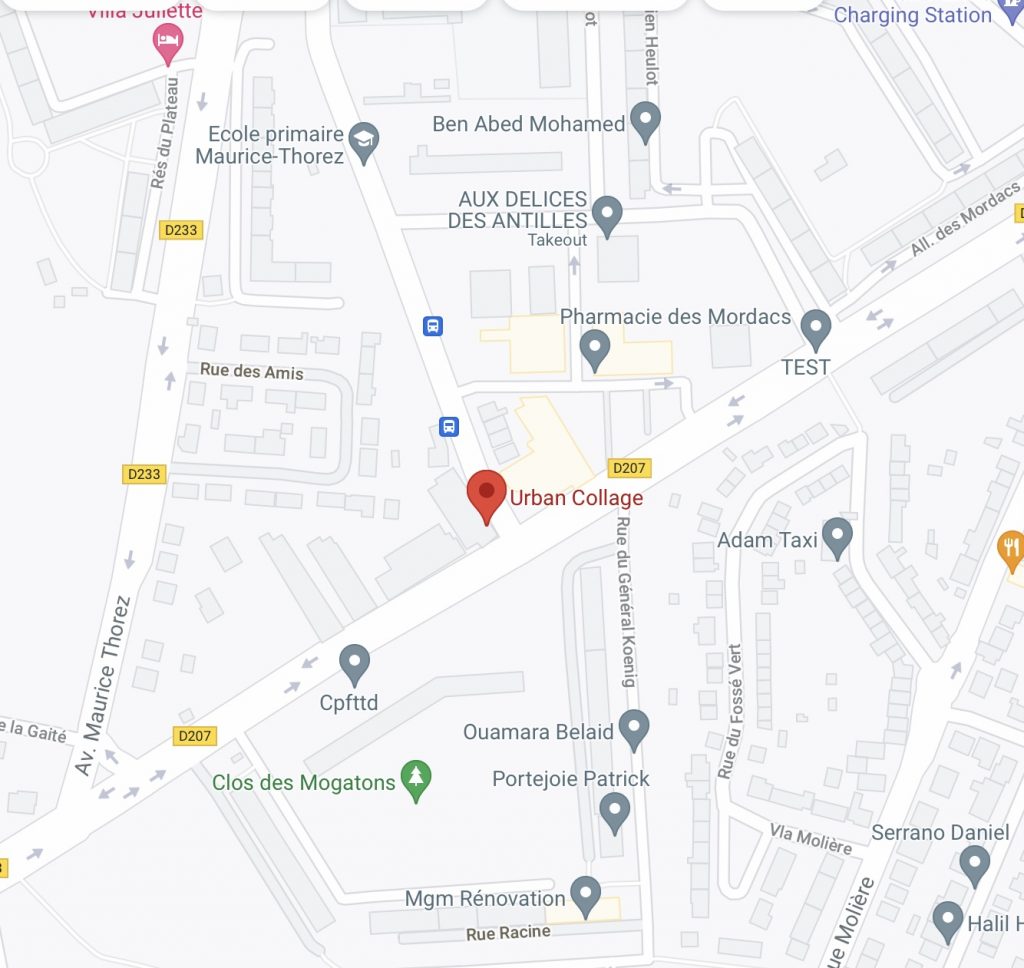
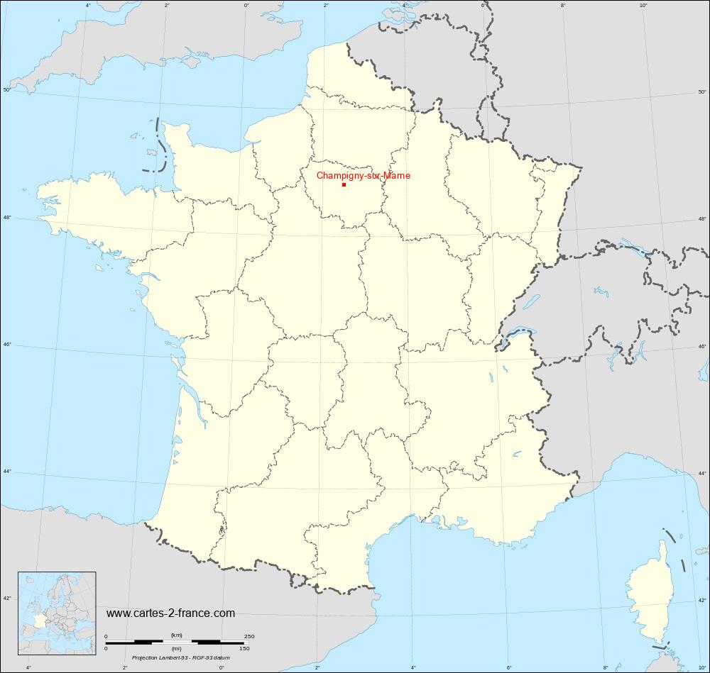
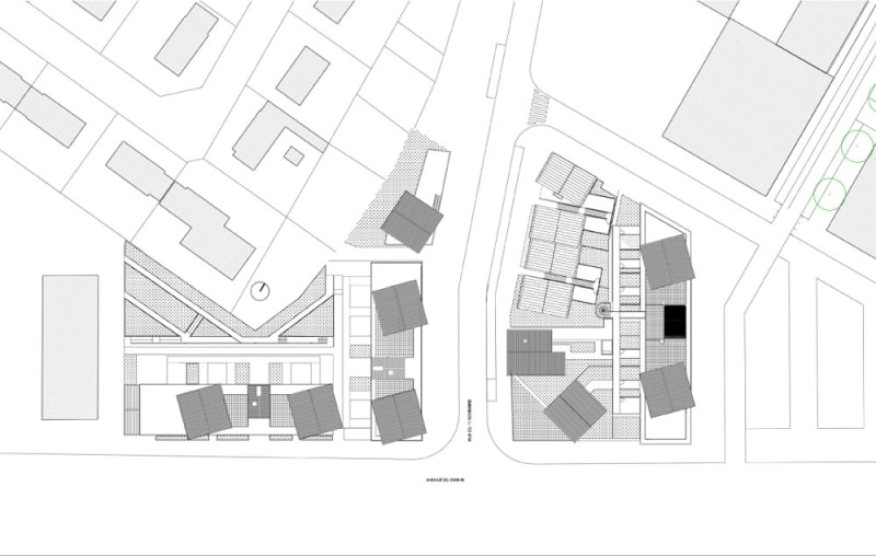
This ensemble of apartments was built in 2012, and located at Champigny-sur-Marne, a commune in the south-east zone of Paris, France.
From the beginning, this project was product of an asked delivery. The program asked for a urban renewal plan based on a new town center with shops and housing. Maison was inspired by the site, and decided to create a building that contained every different existing residential typology of its surrounded suburbs neighborhood (Champigny-sur-Marne), combining all of them in a unique work.
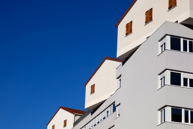
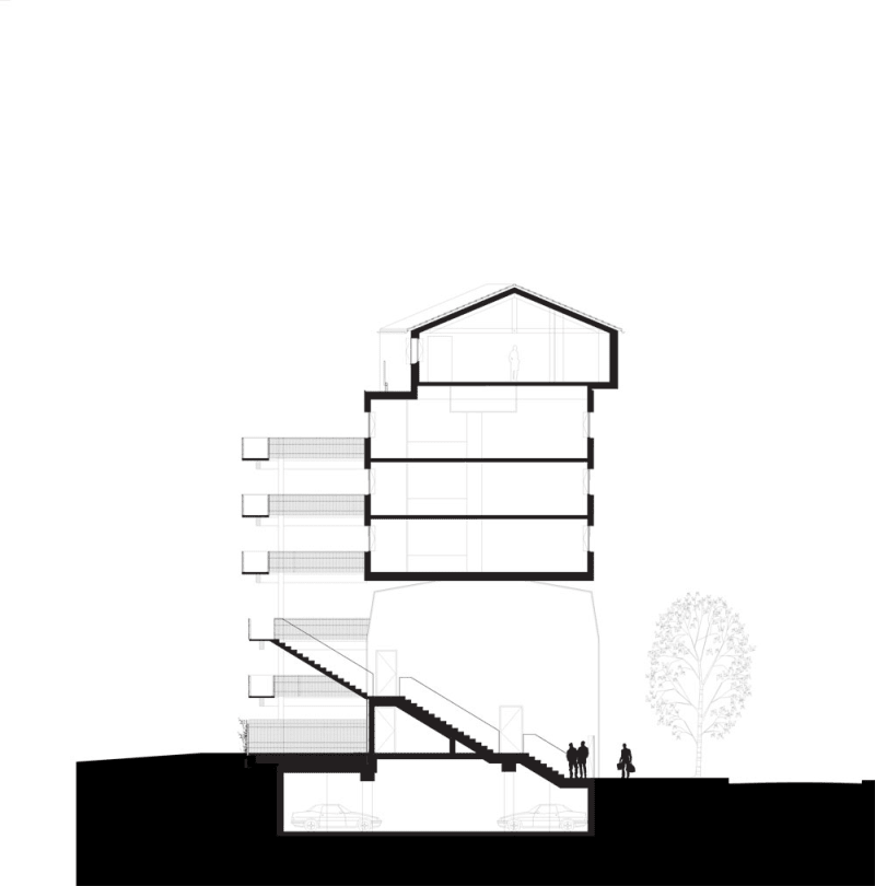
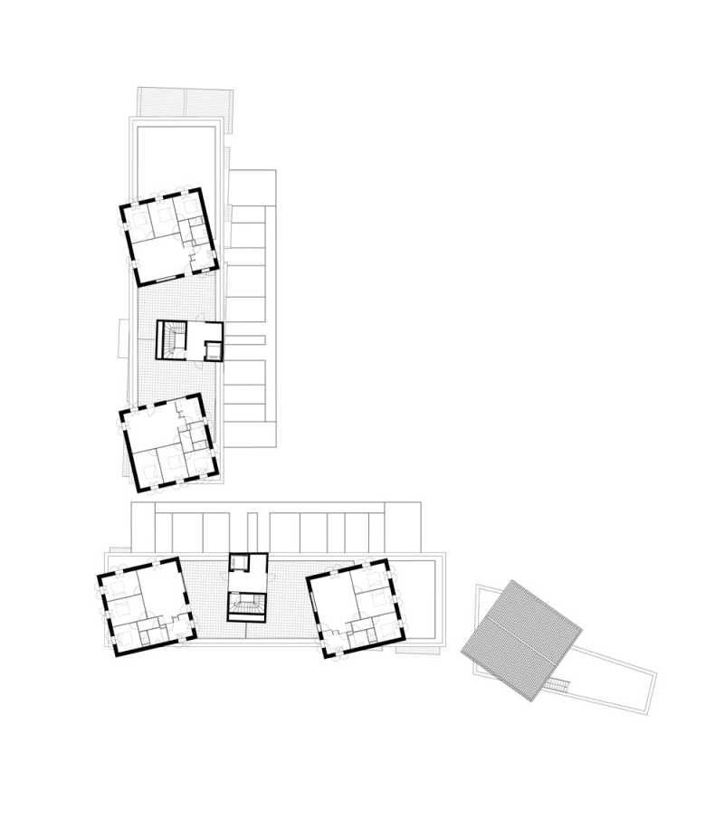
This social housing was constructed on a 9000 m² net floor area, and it provides 114 new residences, shops and parking areas for residents. The general idea and structure of this design would be a three level housing block, with townhouses composing the base, a housing block from the 1950’s in the middle, and single family homes on the roof.
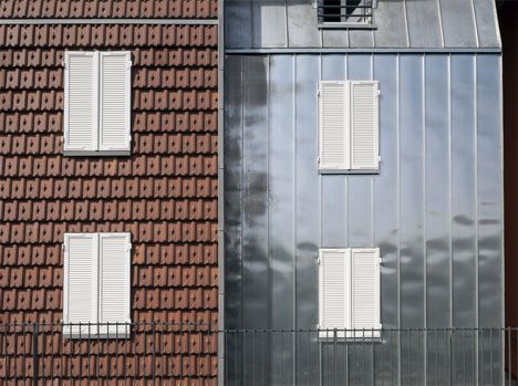
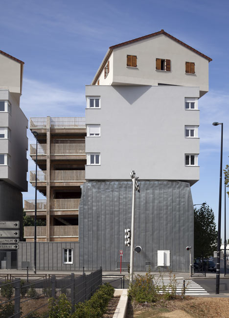
This mixture gives us the unique experience of seeing each layer independent from the others and perceiving it’s unique materials and essence, as they are built one on top of the other but without any transition between them.
Maison also thought about the order, as each level’s choice is not aleatory: he organized them as archetypes to be read from bottom to top.
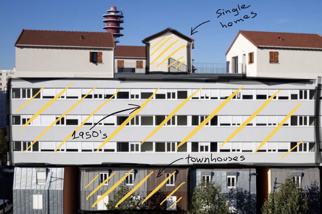
Acting as the whole structure’s base we have three-storey townhouses, which are covered with copper, zinc panel or terracotta tiles placed vertically, and each one has its own entrance from the exterior.
Placed in the middle we have the 1950’s apartments, with a rectangular shape laying on top of the base and a drastic difference of color from the base, as this middle layer is covered by neutral grey plaster.
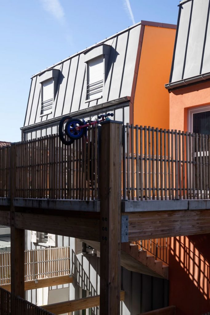
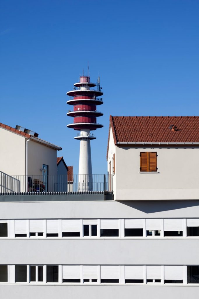
On top of it we find the last level which are the single homes. This ones maintain its off-white color and their common classic orange roofs. There also are wooden structures integrated in the building with some decks. This gives the residents of the social housing some exterior zone in addition to their home.
“The complexity of this project lies in the vertical superposition of these structural elements, shifting the three typologies independently”
The position of each level was carefully analyze and thought for them to be consistent, so then their structural skeletons are able to transfer loads to reach the idea of one coherent ensemble.

The three aspects that caught my attention were:
+MATERIAL: The respect that he has shown by maintaining the original material, even if it has some dramatic changes of essence between the levels really inspired me. This also applies for the color and texture that he decided to use, picking the classic one of each typology. I personally think that all these choices is what gave the work that visual puzzle that it has.
+GEOMETRY: The meticulous use of geometry, having to integrate three different layers so they can function as one really caught me. I find the shape that this project ended up having beautiful and not coherent for the eye, and that’s what I find unique and original from his creation.
+BEAUTY: While describing his design during a talk Maison said:
“I cannot do beauty, because it will make the rest look ugly, so I decided to do something very ugly, to make the rest look pretty.”
Maison Edouard-François
I actually understand his point, but at the same time I disagree, because something that can be called different and unique, can automatically be attributed with the word beautiful too.
The first think that came to my mind when I saw it was a puzzle, it seemed a Tetris game, a pile of buildings, but then you realize you cannot stop analyzing it with your eyes, and that’s what mostly caught my attention.
BIBLIOGRAPHY
https://divisare.com/projects/223044-maison-edouard-francois-paul-raftery-urban-collage
https://www.dezeen.com/2012/11/20/urban-collage-by-maison-edouard-francois/

